JetStream DR offers various metrics reports. By observing metrics, users can have a good understanding of the overall operation and performance of JetStream DR across the protected domain.
- Incoming and Outgoing Data Rate Report (including: foreground data, background data, incoming data, outgoing data)
- RPO (Recovery Point Objective) Report
- Garbage Collection Report
- Replication Log Report
- Cloud Data Report
- Go to the Statistics tab to view reports about the site.
- Select individual reports to view from the Select Chart menu.
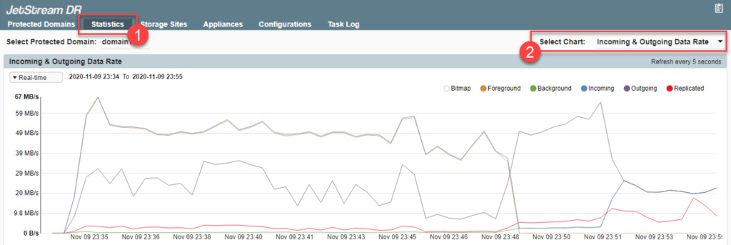
Incoming & Outgoing Data Rate
This line graph uses different colored lines and shading to provide information about various data flow rates. Individual graph elements can be displayed or hidden by toggling the control bubbles. The time span of the chart can be adjusted by making a selection from the menu.
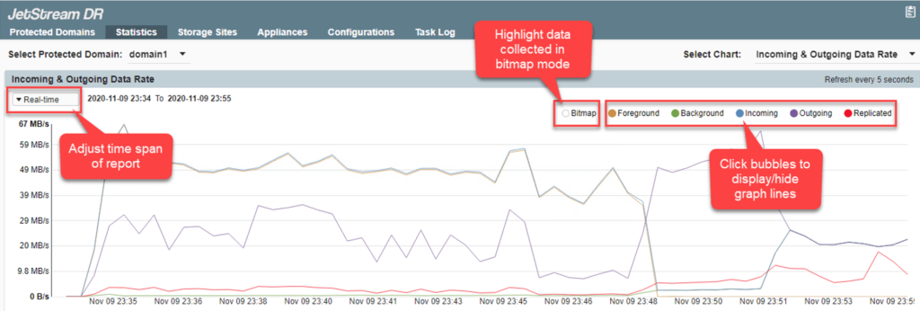
Data represented in the Incoming & Outgoing Data Rate chart are:
- Bitmap data: Highlights on the graph intervals during which data was collected in bitmap mode. (When the connection between the IO Filter and DRVA is interrupted, the IO Filter collects and maintains data in bitmap mode.)
- Foreground data: Draws a line showing data created by the protected VM that are being replicated to the storage site.
- Background data: Draws a line showing pre-existing data on the protected VM that are being transferred to the storage site.
- Incoming data (from IO Filter to DRVA): Draws a line representing data being transferred from the IO Filter to the DRVA. This shows the rate at which data is being written to the DRVA and replication log store prior to transfer across the network to the object store.
- Outgoing data (from DRVA to object store before compression): Draws a line representing raw data being transferred from the DRVA.
- Replicated data (from DRVA to object store after compression): Draws a line representing the rate at which domain data is being replicated to the cloud object store. This provides insight into the performance of the network between the primary site and the storage site, and the efficiency with which data is written to the object store.
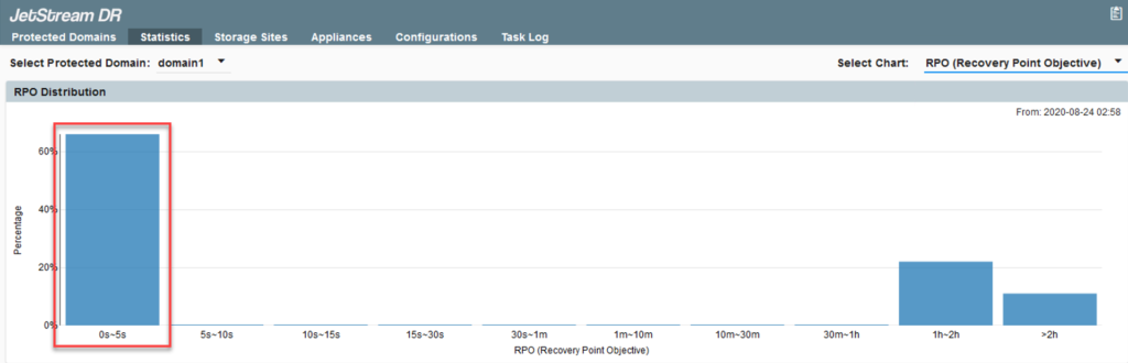
RPO (Recovery Point Objective)
This histogram with 10 buckets (bars) represents different ranges of RPO. With a sufficiently robust network between the primary site and the storage site, RPO should usually fall within the 0s–5s range, but periods when RPO falls outside this goal are shown in the chart and can be used to diagnose network and other issues.
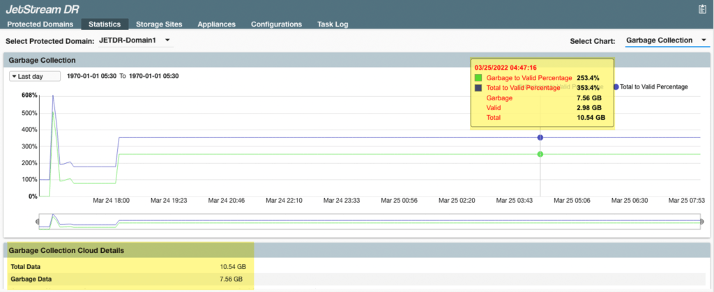
Garbage Collection
This single line graph illustrates the ratio of garbage data to total data. Garbage collection reduces the required capacity in the object store, but it also introduces overhead to the on-premises compute and storage resources, as well as the network between the primary site and the storage site. The lower portion of the screen provides summary information.
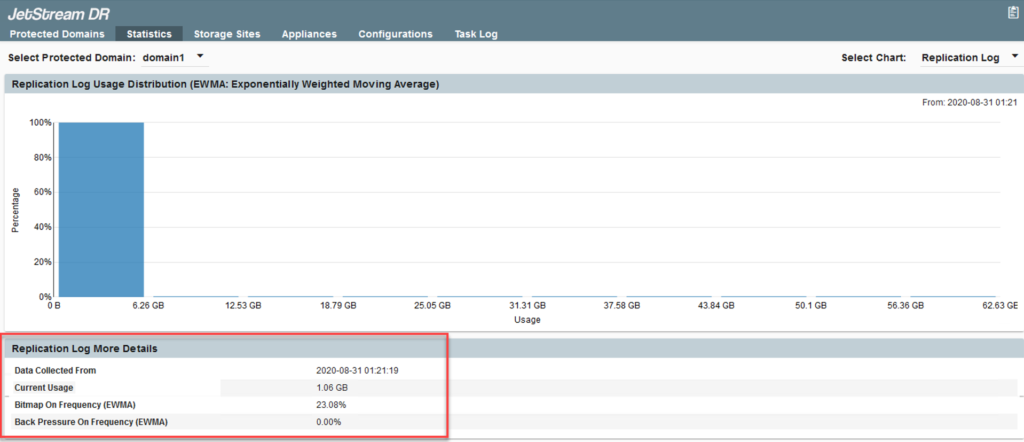
Replication Log
This histogram with 10 buckets (bars) represents amounts of data handled by the replication log store. If the replication log store becomes saturated (indicated by buckets filling on the right side of the screen) system performance will suffer; any underlying issues should be addressed to correct the issue.
The lower portion of the screen provides additional details about the replication log store:
- Data Collected From: The timespan during which data was collected.
- Current Usage: Size of the log at present.
- Bitmap On Frequency: Percentage of operating time that data could not efficiently reach the DRVA, so newly written data was captured by the IO filters in bitmaps for later replication.
- Back Pressure On Frequency: Percentage of operating time that application write operations were slowed to accommodate data replication.
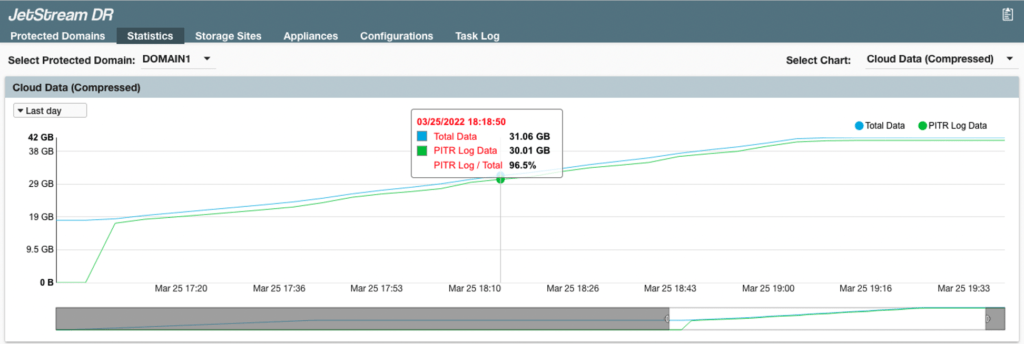
Cloud Data
This line graph provides insight into the consumption of object store storage space when the Point in Time Recovery (PITR) function is used. The graph indicates compressed “total data” and “PITR log data” in the cloud.